The Nonprofit Website Insider
Issue 25: Easy donation page tweaks for year end 💝📈💝
Easy ways to optimize your donation page that you can still do before year end, plus a free webinar to demystify graphic design processes and costs
Hi website champions,
Year-end donation season is coming up fast. For those of us who manage nonprofit websites we’re in that crunch time before Giving Tuesday when changing your online donation tool or new grand strategies are likely off the table. But that doesn’t mean you can’t make some powerful tweaks to your donation page to maximize impact—without introducing risk. Here are a few ideas:
1. Check Your Headline. Does your donation page have a clear, concise headline that tells people why they should give? Think about what resonates with your visitors—what change are they eager to see in the world, and how can they make it happen through you? Make the invitation clear and direct. Think, “Help Us Keep Families Warm This Winter” rather than a generic “Donate Today.”
2. Add Compelling Supporting Text. Invite people to give something that seems practical and meaningful. What will their contribution support? Don’t feel bound to detail every dollar's journey—it's okay to simplify! If you're funding operations, let them know how that sustains your mission. “You’re helping keep animals safe” works, even if the funds will go into your general operating fund. The message here: tie their gift to impact, not the logistics.
3. Freshen Up the Photo. A picture is worth a thousand words (or at least a few hundred bucks). Choose an upbeat, vivid photo that relates to your mission—look for pictures that include happy people, or at least cute animals. And make sure the main subject of the photo is large enough to easily see on mobile screens.
4. Display Your Charity Badges. Visitors want to know they’re giving to a trustworthy organization. Show off any certification badges you have on your donation page if your tool allows it.
5. Don’t Forget Email Outreach. Even the best donation page won’t bring people in on its own. This is where your email list comes in. Plan a series of emails to get the word out—three emails often works well. Social media is great for awareness but won’t drive donations like your emails will.
It’s not too late to make a small adjustment or two that can make a substantial difference this donation season.
Happy fundraising,
Laura
An Example
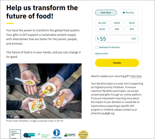
The Good Food Institute has a mission that's not easy to illustrate or describe, but they do a great job inviting visitors to help and explaining why donations matter. And check out that row of certification badges!
Dive Deeper
How to write effective short donations messages | Betterworld
Writing headlines, summary text for a donation page, or quick, punchy fundraising emails is no easy task. This article offers some excellent tips to help.
The top three charity rating & badge programs for nonprofits | Nonprofit Tech for Good
Looking to get your nonprofit certified with a recognizable badEasge? Here are three programs to consider. If your nonprofit has been around for a while, you may already be certified without even realizing it.
Choosing images for digital fundraising | Best Friends Network Partners
Here’s a bit more on choosing effective images. Even the Best Friends network, which focuses on animals, recommends including people in the photos!
Free Webinar
Understanding website graphic design costs: What’s behind the price tag?
Wednesday, November 13, Noon -1 ET
Are you struggling to understand why website graphic design prices for nonprofits can range from $2,000 to $40,000? (And yes, sometimes even more!) Whether you're just thinking about freshening up your logo or dreaming about a total website makeover, it helps to know what those extra zeros actually buy you.
The Nonprofit Website Insider is hosting Lauren Atherton, the brain behind HeartSpark Design. She's seen it all—from scrappy startups making templates work to established nonprofits investing in custom designs. In this webinar, she’ll talk through the possibilities – no jargon, no sales pitch, just straight talk about what different design options really mean for your nonprofit.
What you’ll learn:
How design affects donor trust
A no-nonsense overview of your options—from DIY templates to fancy agencies
The pros and cons of each route, including pricing, timelines, and quality
Practical tips for finding the right design partner who understands both your mission and your budget
By the end, you'll understand exactly what you're paying for at different price points and how to make smart choices for your 2025 plans.

