ARTICLE
Defining Priorities via Digital Cardsorting
Here’s a scenario that might sound familiar: You have a complicated website that hasn’t gotten much love in a little too long. Your staff have different perspectives about what’s most important to take on. You want to begin with some incremental improvements to the site, but it’s daunting and potentially politically tricky to even pick a place to start. You want to create a shared project vision.
Working with Capellic, a website consulting firm, I helped the Learning Policy Institute with a process that might help you as well. In their case, they needed to make a substantial upgrade in their content management system - to move from Drupal 7 to Drupal 9 - and hired us to develop a strategy for what upgrades to their site they should make at the same time.
Mandy Rodrigues, Web Manager at the Learning Policy Institute, said:
“It was important to us to get the most benefit we could out of a website upgrade, but of course we only had a limited budget. We gathered a list of about 30 different potential website enhancements to prioritize, and needed to get input from about 15 different internal stakeholders as to what they thought was most important.”
This is a situation in which cardsorting can be really helpful. Much prized by user experience professionals to do user research about navigation, cardsorting can be a surprisingly inexpensive and easy way to wrangle many opinions into quickly usable data. You create multiple “cards” — traditionally, physical index cards— and ask participants to categorize them.
In this case, we created a “digital card” for each of the potential website enhancements and asked our stakeholders to use an online tool to put each into a category of:
Must Have
Should Have
Nice to Have
Don’t Bother
I Don’t Understand This
The priorities on the “cards” were fairly high level, non-technical features like “Ability to find research by state or city” or “Improve staff listing to make it easier to find individual staff members.”
Before the cardsorting itself, we did some work to define and consolidate opinions around website audiences and goals. Logically, it’s important to make sure that the participants are on the same page as to what they’re trying to achieve before they can prioritize more specifically.
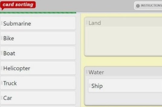
We needed to do an online cardsort, as all the stakeholders were working out of their house due to the coronavirus. We used UsabiliTest.com, which was very affordable and worked perfectly for us. It was easy to upload our 26 “cards” into a stakeholder interface and to see clear data analysis views at the end of the data collection. UsabiliTest.com has since been acquired and is not longer available - but there’s number of inexpensive online options. JustinMind.com provides a good list at the end of his article on cardsorting.
From old UsabilityTest.com online demo
We gave the participants about a week to complete the card sort, with a couple of email reminders to do so. At the end, the tool provided us a straightforward analysis of the answers, in this format:
From old online UsabilityTest demo
Our data, logically, wasn’t so nice and clean as the demo data above… but it wasn’t far off. We created a spreadsheet for review and discussion with all 15 of the stakeholders which grouped the features into things that, based on the data, were “Clearly Critical”, “Clearly Important” and “Clearly Not a Priority Right Now.” There were only seven of the 26 that we identified as “Needs More Discussion”. These seven were items that either had a wide range of opinion about them, or a number of people didn’t understand them, or both.
In an hour conference call with all 15 stakeholders, we were able to finalize the priorities for each of the 26 features. We quickly ratified the data for the first “Clear” three categories, leaving the bulk of the time to discuss and come to a conclusion on the remaining seven features that really did benefit from the conversation.
Mandy says:
“It can be tricky to effectively balance the perspectives and priorities of our whole leadership team. The cardsorting process that Laura introduced provided a really valuable tool to quickly move from many individual opinions to a set of shared priorities. ”
This whole process took about three weeks. It reaffirmed again my belief in the power of data: when faced with a complicated problem, is there a way that you can get more data? Cardsorting should definitely be in your toolbox as a relatively quick and easy way to collect various points of view and translate them to data.


